Dapple’s Identity Crisis
I want to take some time today and reflect on the game design for Dapple. As the game’s designer, it’s often hard to remove oneself from the game and look at it somewhat objectively. I’ll never be able to look at the game with complete objectivity; I’ve spent far too much time thinking about it. However, I’m starting to gather a decent amount of data on why people aren’t buying the game, so I want to talk about some of it here.
As the designer of the game, it’s hard when people don’t like the game. I realise that not everyone likes every game; that’s obvious. However, Dapple seems to be lacking traction in the two demographics that I thought it would have the best chance in: hardcore puzzle gamers, and casual gamers. So, I want to look at where Dapple isn’t succeeding as well as I thought it would, in the hopes that I can learn from this for my next game.
Disclaimer: It’s worth pointing out that I’m generalizing greatly here. This is not true of all players, but I’m starting to see a trend when I ask for feedback on why people chose not to buy the game.
I’ve been gradually receiving feedback on Dapple from players who have tried the game, or players who have tried the Lite version of the game and decided not to purchase the full version. I’ve been talking with players on the Touch Arcade forums, and the inclusion of a Feedback button in the game and the lite version seems to be helping. I also read all of the reviews that get posted in the App Store across all countries.
In following all of this for the past 6 weeks or so, since Dapple was released, a common thread is starting to emerge among players who aren’t enjoying the game: it’s too difficult.
The difficulty of the game is something that I spent a lot of time on during development of the game. There is a learning curve associated with it: you need to spend some time with the game in order to learn how the colours mix. However, it seems like Dapple is suffering from a bit of an identity crisis in this regard.
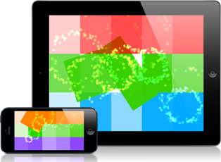
Dapple is a game that plays like a hardcore puzzle game, but that looks like a light casual game. I think one of the problems I’m having with the game is one of perception. Hardcore puzzle game players dismiss it immediately because it looks like a casual game. Casual gamers download the Lite version and when they don’t “get it” immediately, they stop playing out of frustration.
I say that Dapple plays like a “hardcore” game, because it requires real thought and concentration when you’re learning to play. It’s not a game that you can succeed at early on without some thought. Players who expect to be able to jump in and “grok” (see “Stranger in a Strange Land” and “A Theory of Fun for Game Design”) the game instantaneously are going to be frustrated that it doesn’t play like other matching games. You have to learn to play the game to be good at it. However, feedback I receive from people who love the game suggests that after playing it for a certain amount of time, things suddenly “click” and the game becomes incredibly addictive. What’s interesting to me is that the “click” happens at different times for different people. Some people get it very quickly. For some others, it takes time.
I suspect that this is why I’ve generally received such positive reviews from review sites. Reviewers play a game until they understand it, because they’re trying to provide the reader with an complete view of the game. These reviewers are playing up to (and past) the point of that “click” and they end up really liking the game.
I think the problem is that the average person who downloads a game for their iPhone is looking for something they can grok instantly. Dapple is a game that, once you “get” it, can be played in very short bursts and is ideally suited for the iPhone in that regard. However, it can’t be grokked instantly, and I think that’s the biggest design flaw with the game.
In “A Theory of Fun”, one of arguments Koster makes is that “[t]he definition of a good game is…’one that teaches everything it has to offer before the player stops playing.’” This is true of Dapple if players play until the game “clicks”, but Dapple fails in this when players give up before that point.
All of this begs the question: how do I fix this?
I have done certain things in the game to help players learn:
- “How to Play” popups that come up the first time you play, and are accessible in the Pause Menu and Main Menu
- Hint arrow that comes up quickly on early levels, and more slowly on later levels that shows players where mixes are avaible (and the hints can be turned off by the user if it bugs them)
- Early levels don’t have any “malicious” elements in the game, letting users play without worrying about losing
- Putting a finger on the paint palette icon at the bottom of the screen shows how colours mix
However, clearly this isn’t addressing the issue. People have trouble remembering that Red + Yellow = Orange. One of the most common complaints is that people felt like they had to use the paint palette help every turn and felt like they couldn’t learn it.
To be honest, I’m not sure what the solution is, or if there is one, even. I’ve thought about things like:
- A tutorial mode – but this is tricky…a lot of users will ignore tutorials altogether
- I was talking to a guy at the Toronto IGDA meetup and he asked almost immediately if there was a mode where he could play with a subset of colours. This is something I considered during development, but wasn’t sure it would work. Now I’m starting to think about that more seriously. The idea being that users could play a game using only Red, Orange, and Yellow. Once they were comfortable with those colours, switch to Yellow, Green and Blue, and so on. It would be a kind of “Learners” or “Practice” mode.
I am planning further updates to Dapple, so maybe one of these ideas will make it into the next update. I think it’s clear that I don’t have a good solution yet, so I think I need to give it more thought. If you have played the game and have any suggestions, please send me an email, or post in the comments. Email can be sent to: dapple [at] streamingcolour [dot] com.
Game design, like so many other creative endeavors, is going to be a life-long learning process. I hope that by doing this kind of analysis on my own work that it will help me to grow in this regard. All I can ask is that each game I create teaches me something new. My hope is that with each game I create, I will teach the player something new too.
Owen


Hey Owen,
I’ve played the game and what I found frustrating at first was that the paint brush kept changing colours each time. So as a new user, I had to learn and remember every colour combo right away. As an alternative to having a sub set of colours, how about a simple mode where the paint brush stays the same colour for say 5-10 turns. So the user gets to know, Red+Yellow=Orange, Red+Blue=Purple etc, once they know how to mix Red, they’ll be able to move on to Yellow etc.
I seem to be having the exact same difficulty’s with my game. In the update we did include an interactive tutorial version to help address this, and we include a color palette to address the color blending issues, but it still seems to have to long of a gap between the playing and the ‘click’.
BTW, in my game to further the confusion the color mixing is actually additive color blending. Red + Green = Yellow
Great article. I think the reduced color idea could help – help me move towards flow early in the game. But don’t make it a tutorial mode, have the game start there and progress to more colors when you know they are ready (score threshold?) I too don’t know how to mix paint colors and saw no appeal in trying to learn.
I just read ‘4 Steps to The Epiphany’ which really helped me think about the different kinds of users in the market. Your breakdown of users as reviewers, hardcore, and casual fits this. My Smart Caller app has big problems with these aspects too – trying to appeal to two different groups of users leaves both groups unsatisfied. The books main thesis is a ‘Customer Development Cycle’ with which a company better learns to use customer feedback. Check it out:
http://www.amazon.com/Four-Steps-Epiphany-Steven-Blank/dp/0976470705/ref=pd_bbs_sr_1?ie=UTF8&s=books&qid=1239124082&sr=8-1
Hi Owen, from an outsiders perspective i would say that the “subset” idea is the way to go, see if you can break the game down to an easier mode so that the “click” happens within a few minutes, and allow the user to move upward from there.
all the best!
… and what Dave Wood said!
@Dave Wood – I like that idea, but it might not work in practice. The game chooses colour each turn from a subset of colours that can currently make matches. It’s quite possible that, for a given turn, blue is the only possible colour that will make a match. I suppose I could tell it to “prefer” a certain colour for X number of turns. What your talking about would certainly be the simplest solution, code-wise.
@Carrie – Yeah, I can imagine that teaching people the additive colour system would be even more difficult…
@MarkJ – I do want to stay away from a Tutorial, if I can. I’m just not sure how I would integrate a reduced-colour mode into the game nicely without having a separate mode. I will give it some thought. Thanks for the book recommendation. I’ll take a look.
@Michael D – Thanks for the feedback.
I think the colour subset is a great idea. I also think that being able to see your brush color immediately after your move rather than waiting for a chain to finish would help (if this was addressed in 1.1 I haven’t played it yet).
Things that would scale the game to be easier
1. Could you also have a paint brush button that would apply it to all tiles on the board? Sort of an on/off thing so you could rapidly see what that brush color would do? I personally don’t remember the this + this = that equation. I would rather look at the board with the changes in place so I can select WHICH location to hit, rather than WHAT COLOR it will change to.
2. How about having the colour wheel at the bottom let you select what color the brush is at the start of the game and then slowly restrict the brush selection wheel as the levels increase and have it spin to a colour? This would let you have more flexibility at the beginning of the game in finding the perfect move and then restrict you later.
This post is brutally honest, I hope it will help you…
Usually I love those puzzle games where you need to match gems to remove them from the board. But when I tried your game, I deleted it after 3 minutes.
The reason? It felt like you took the same basic puzzle principle (gem matching) that everybody loves but added some complexity on top of it just to make it different… but it’s not fun at all. It’s like all you really did is make the user input much more complicated but the game mechanism is the same.
As if Microsoft suddenly decided that in Windows, to be able to click any button with your mouse, you’d first have to fill in a captcha because it’s more fun… for every click! Well it does not change the point of the click, it just makes the whole clicking process longer and a pain.
Your game feels the same way, you took a simple working concept and broke it for the sake of it. I think that when it “clicks” for some people, it’s only because they’ve played enough so that the “captcha” thinking is now automatic for them… and so it gets transparent at some point and they are back playing the simple gem matching we are all used and loved to!
I’m sorry if this sounds harsh but this is how your game feels to me. I didn’t read any book on the subject, simply have been playing for the past 25 years. Puzzle concepts are successful because they are simple and addictive. You only have 2 options to make a new one:
1) taking an already working concept and adding/changing the way it works… which is a recipe for disaster most of the time (“puzzle quest” is an exception for example)
2) or inventing an original new concept puzzle which works but this is even harder to do!
So my 2 cents is stop wasting your time on dapple, it will always stay a niche game and you will never make enough money out of it whatever tweaking you will implement. If you want to make a living from games, you need to be able to make this kind of tough call and move on to the next one.
Good luck!
I don’t know if you remember, but when I tried out Dapple on your iPhone, I saw the How to Play section and just saw a screen of text and was thinking, “Wow, this looks complicated, I don’t want to have to read through all this right now. I’m at an iPhone conference and my head is so full of stuff and mentally drained and I don’t feel like wrapping my head around something difficult right now.” I think this may be the general mindset of people playing iPhone games. To relax. Just finished a long day, I think I’ll sit down with my iPhone and play a nice relaxing game. The last thing I want is to be confronted with a bunch of rules.
So, you may be wondering, how do you get to this user? Simple, show a video tutorial. Dave Wilson integrated a video into his app SpinCalc to help people easily understand the power of his app among people who don’t feel like reading a bunch of instructions, but wouldn’t mind relaxing and watching a quick video tutorial.
Personally, I agree that a tutorial is a bad idea. Really it means you’re making things too complex too quickly. The comment above me also echos this. Yes you could show a video but would that really solve the problem? This is a “code smell” situation and a video is just deodorant.
I like the idea that people have been kicking around of a reduced color palate at the outset. Couldn’t you turn off some of the mechanics at the beginning as well? Then as the player progresses start to mix them in alongside some cues to catch the player’s attention?
[...] the full post at Streaming Colour Studios » Blog Archive » Dapple’s Identity Crisis. Posted by Matthias Kiefer Filed in Games, Product Managment Tags: Game Design, Games, iPhone [...]
Being a fellow iPhone developer I was wondering how your lite version was working out for sales and if you were seeing any better traction. Judging from your post, not as much as you were hoping for. Still any update on your sales would be interesting to the me and probably the other iPhone developers looking for ways to increase app sales.
Just an idea on your game. Could you maybe change the piece sizes and limit the color selection at the entry level and then as the user progresses the pieces grow smaller and you add additional colors. Some way for users to win quickly… kind of like a training mode and bring them up the learning curve before they have to start solving more complex puzzles.
Looking at just the screen shots the game looks complicated, maybe with larger pieces it might look less complex…. Progress could be dictated by the amount of time it takes the user to solve the puzzle. The less time to solve means the user is getting better and learning the game, the more complex the game gets. If the user takes a longer time, the user might stay at the same level until they start to solve puzzles under a certain amount of time. Maybe this is way too complex!
)
Thanks for sharing your thoughts and data.
Hi Owen. Thanks for writing this up. It’s probably one of the major hurdles that any game developer faces (if they’re not just making a clone of an existing archetype). I think that your commenters have hit the nail on the head – make the first several levels a very small subset of the game so they can get familiar with things. If you change the brush color, don’t for the first bit. Let the user get comfortable with what they have. Introduce new concepts slowly. Bejeweled did this well – the basic flow was established and then they introduced new concepts. Chuzzle did the same thing – it introduced Lock chuzzles around level 10 that prevented you from being able to move some pieces. Players became more immersed in the game and new rules could throw them for a loop, but they were introduced slowly.
Slow game play introduction is, imo, the way to go – tutorials, especially if they’re text screens, are not helpful. Two games that I’ve played – iMob and iMafia – both have PAGES of help text. All of which is out-of-date and complicated. I have yet to determine the best way to manage this for the game I’m writing, but I have an idea that I think will work.
This is one of those things that comes with experience and understanding your user base. I think that your next update to Dapple can integrate these theories into something quite usable. And possibly convert more of those trials into purchases.
Good luck!
Hey Owen.
I don’t have the full version, but I do have the lite version. It’s an interesting premise you have going. I think you are correct, it is partly a learning curve issue. As others have mentioned, you could build that more into the game some. I like the idea of having less colors to start with. You could also populate the board a bit more friendly at lvl 1 than later on, it seems like about 1/3 to 1/2 of the board doesn’t change much in any given game. (Maybe I’m just that bad…. =) ) Certain combinations of paint splotches on the board are pretty much immovable from the start due to the adjoining squares.
One thing that wasn’t immediately intuitive to me was the paintbrush. I assumed I could change the color of paint that was on it rather than changing the paint on the board with the pre-filled paintbrush. Have you tried allowing the user to change the paint color on the brush? First thing that comes to mind here would be having a rotating color choice of 3 colors on the bottom. You could have this rotate each turn or as the user uses one color randomly fill it in with another. It might be worth exploring. Right now as a player I don’t feel like I have much control of the game, I’m simply walking through a set of possibilities that narrows too quickly over the course of a game.
Have you thought of using the accelerometer to let things fall “down” regardless of which way the device is turned? That could add an interesting strategic aspect to the gameplay.
I was also confused about the game over conditions. I am assuming that it is game over once I get a color that I cannot use directly to get a match? Maybe I missed the help on that but I didn’t see that explained anywhere. If this is the case you might consider having the colors randomize in a visually appealing way instead of a too-quick game over. Sometimes I felt like I was just getting the hang of things and got interrupted by the end of the game.
It definitely feels a bit “off” to me from a user standpoint. I think your theme is good, if a little misleading. it gives the wrong impression of what you can and can’t do. Some definite potential there and what you have isn’t bad.
Looking forward to what you do with this going forward!
I have to agree with YYs last comment. I’ve found myself in this rut as well. I could perfect and refine my application over and over, but it’s really not gonna affect my sales (except that re-releasing does give you that few days on the sort by date list and your sales will spike). I’m moving onto the next project and letting the current one do what it may.
To RichC… in my case the Lite version made all the difference in the world. It moved into the top 100 entertainment free apps and brought along the pay version for the ride (#36 on free and #61 on pay). There seems to me a momentum thing there. Once you get in the top 50 (first 2 pages) you seem to kinda hover around there. I observed that making it into the top 20 in your category, puts you in the top 100 in the overall app list (so #20 in entertainment becomes like #99 or #100 in top 100).
I am anxious to here Owen’s results.
I prefer colour blind mode because the differentiation in the shapes helps me understand how to blend the colours. Although that may because I am colour blind… I think the hints the different shapes give you would be helpful for non-colour blind users.
I haven’t played the game (wanted to finish reading this post before going to check it out) but I still have to comment.
I read a review of the game a while back, and it looked cool. But there wasn’t a Lite version at the time and $5 is tough considering the crowded market (it’s on sale now but not when I read the review – had it been $3 at review time I would have been more interested in it). I’m not implying the game isn’t worth $5, but you know… it’s the App Store. $5 can buy a lot of time killers.
As I was reading this post I was thinking, what’s so hard about matching colors? Then I got to the part about offering a subset of colors and said, WHAT?!
I had ASSUMED you would start with a small palette and add colors as you progress. Instead, you’re offering the ENTIRE palette from the start?! Without even playing the game I’m sure this is the number one problem. Like others have said, fix this and the game will be infinitely more enjoyable to new players.
Let me learn the mechanics of the game before asking me to memorize a bunch of color combinations. Teach me a little at a time and let me build on what I’ve learned. Then as I’m progressing, I get a feeling of accomplishment beyond just a higher score.
As for the “casual look/hardcore play” dynamic, why not offer a second skin as an option, and make the “hardcore” version look grown up, and make the cartoony version easier. Change the name at the same time to Dapple Deluxe or something that sounds grown up, and offer both game options at start up.
Anyways, great posts and thanks for being so candid with your App Store experience.
[...] recently wrote an analysis of, what I called, “Dapple’s Identity Crisis“, in which I talk about some of the design lessons I’ve learned from [...]
Wanted to say thanks for all the great info on this blog. As gratitude I wanted to offer suggestions I think might help you.
Seems like a lot of people have posted and I don’t really have time to read all the posts so appologies if these ideas had already been sugested.
Subset Mode – I think that is one option but what I would suggest is rather than only use 3 colors for the who game, you would just have colors start showing up as the game progressed. For instance, in the begining there are two colors on the board and two colors for your paint brush. After so many points a third color is “un-locked” (people love to un-lock stuff). This continues and as the player gets a higher and higher score more colors are introduced. Similar to increasing the speed on tetris the player is forced to master more colors later in the game if they really want to get that top score.
Also, you could have bench marks. For instance, once you unlock the third color you can then “continue” from that location. Again similar to tetris when you could start on higher speeds rather than start at the begining if you really just want to get into the difficult part of that game first rather then take all the time to progress to those additional colors.
What you could also do is even though you can jump start the game by “continuing”, if you wanted the most points you would need to start from the beginning. If you were to start on level 1 and die in level 5 you would have more points at the end of level 5 then if you had jumped to level 2 and died on level 5.
The cheat sheet is nice but its a distraction to have to bring it up each time. I would suggest modifying the color palate at the bottom to show something like
Red
Yellow Blue
in a triangle… and secondary colors on a triangle
orange Purple
Green
You would want to overlay those to get
Red
Orange Purple
Yellow Blue
Green
Thats supposed to look more like a star of David (I think thats what you call it)
What you have is very similar but its off center. Anyways, This is what you can do, I was looking at your color chart and you have the promary colors mixing correctly to the secondary colors but what I didn’t understand is why when you mix a primary with a secondary you get the primary color. Why not have colors “subtract” and “add”?
You mix Red and Blue you get Purple… they are additive. You mix Red with Purple and you get Blue… they are subtract-ive (I’m sure there’s a better word for that)
You can also entertain the idea of having colors not mix at all… brown is a nasty color, perhaps you could have a penalty for making brown? Or is that too tough?
On the color “star” you could the color on the brush show up glowing with lines connecting the possibilities… the color of the line would be the resulting color of the mix. Disable that feature for a score bonus.
You can also look into letting people select a character to play as. Characters could then have special “powers” they can use once it is charged up. The special power could be initiated with a special swipe on the screen, like a triangle or circle – just make the gesture different for different characters so that it adds another dimension.
People love “powers” look at that break ball game people always play because it drops “power’s” every time you break a block.
Oh and I know people gave you a hard time about the 4.99 and you did lower it to 2.99 stating that you will not go any lower. Personally I think that you are still hurting yourself because the number one match 3 game out there is going for 2.99 and its easy to just subsitute… people will tend to gravitate to Bejeweled. Go for 0.99 because as a new company you gotta build a fan base before charging the same price has well established companies. Its up to you what to charge but I think that if you get a lot of people playing this game you will get more people playing your next game.
I think you have a great game here and I think you can still turn it into a 1,000,000 downloads.
Owen, I haven’t played your game, but here’s a thought about how to make it easier to learn: You could have an AI mode that runs in the early levels that detects when a player is “not grokking” the game and “pops up” with a hint or two. Sort of like an experienced player watching over your shoulder.
Just tried out the lite version to see what the fuss (in these comments) is about.
Honestly, I think understanding your *tutorial* is more difficult than understanding your game.
Maybe rethink the tutorial itself? Show lots of “match” examples?